If you’ve ever used rounded corners (CSS property border-radius) for nested elements, you might have noticed that it doesn’t always look aesthetically pleasing and two nested elements can feel a bit “off”. People are very sensitive to uneven curvature because our visual system is very good at perceiving it.
When you use the same border radius for nested elements, the curves don’t run parallel to each other. The inner curve appears thicker and bulkier at the corners compared to the sides.
Using the same radius everywhere
A border radius creates a circular arc. When two circles have the same radius but different center points, they are not parallel — they will eventually intersect or diverge.
If you don’t give it a little care, nested elements with rounded corners will look bad.
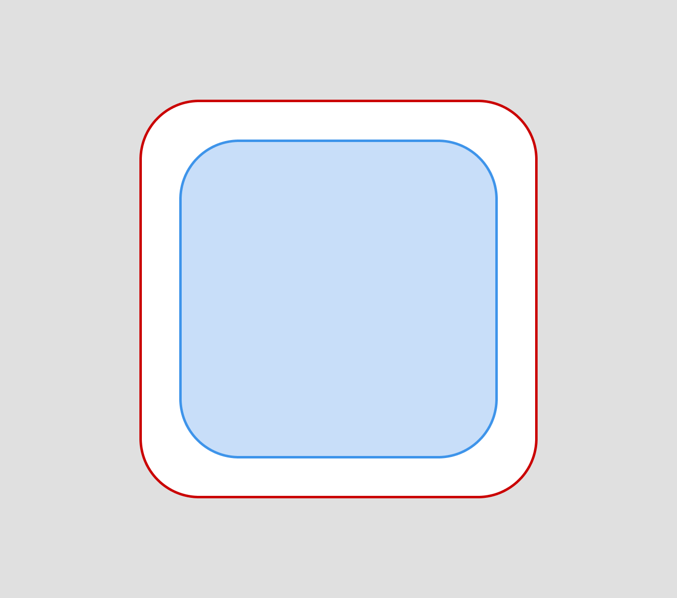
This also applies when the gap between elements is smaller, as well as the rounding of the elements themselves.
Be precise with the radius
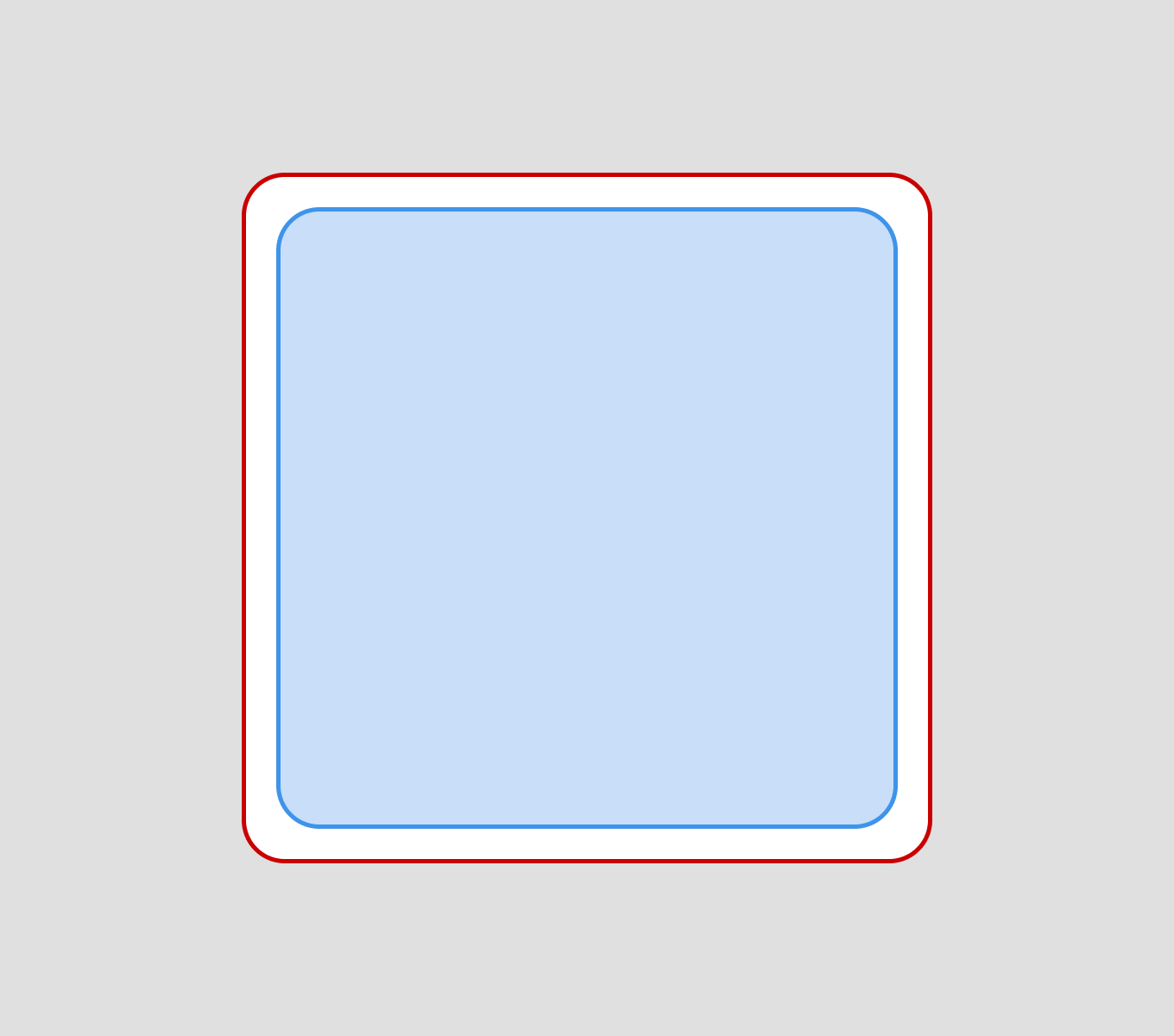
If we want two nested elements to look good, we need to adjust the rounding of either the inner or outer element.
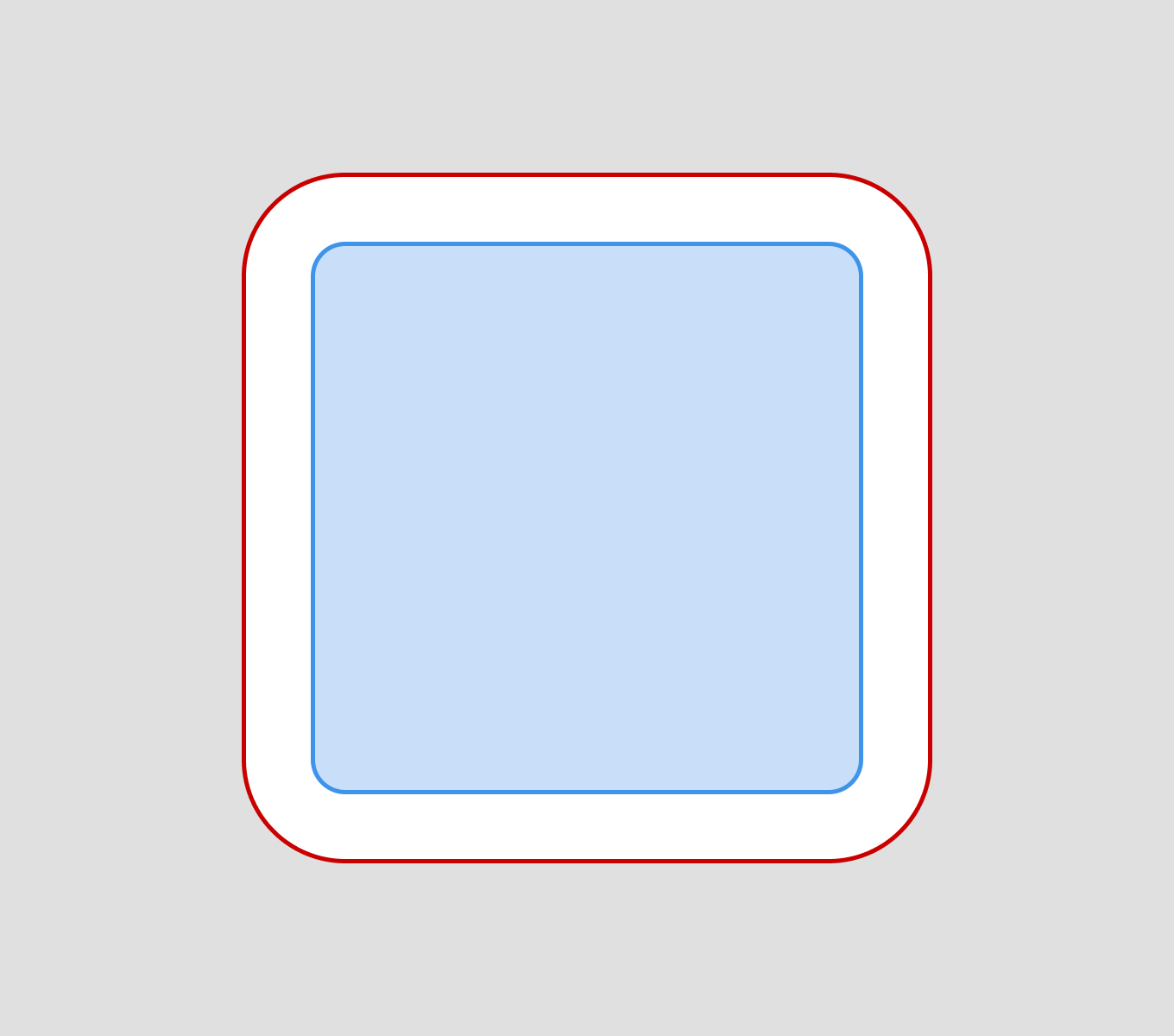
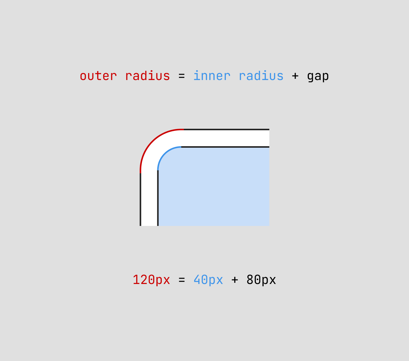
The border radius of the outer element should be equal to the sum of the border radius of the inner element and the distance between the two elements.
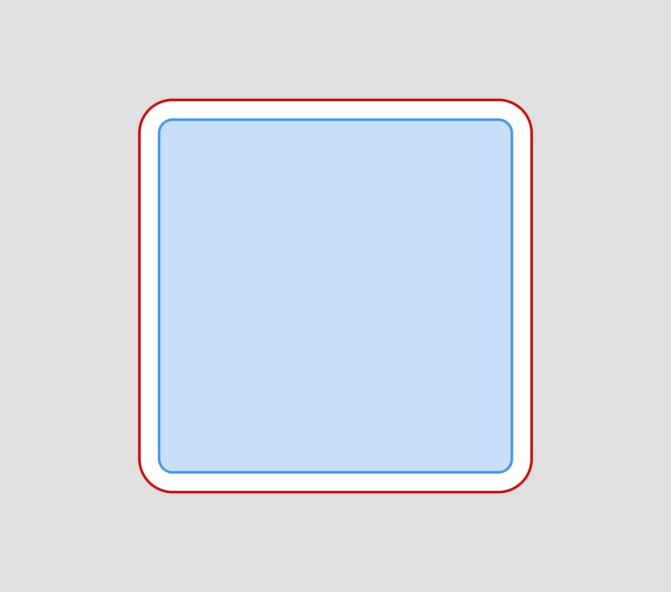
Concentric offset principle
The concentric offset principle is a design technique where nested elements share the same center point, but have different border radius to maintain consistent spacing between them.
This ConcentricRectangle technique was mentioned at Apple WWDC 2025. Sketch also released new property auto for corner styles, keeping them concentric automatically as the container’s radius changes, without manual updates.
Formula
There is a formula that can’t always be used, but it works for most cases. The outer border radius must be the sum of the inner border radius and the spacing (padding, margin, gap) between the elements.
CSS
In CSS, you can apply concentric offset by setting different border-radius values for nested elements, where the inner radius is reduced by the padding amount.
.outer-element {
  border-radius: 16px;
  padding: 8px;
}

.inner-element {
  border-radius: 8px; /* 16px - 8px = 8px */
}
It doesn’t matter which programming language you use, this design principle can be applied anywhere. Some platforms have built-in methods that allow you to achieve the desired result right away, while others will require a bit of math.
Why it’s important?
Our eyes are naturally drawn to inconsistencies. The uneven spacing at corners vs. sides creates visual tension that feels “off” even if we can’t immediately explain why.
These micro-details add up and contribute to the quality that I believe is important to focus on. A well-crafted interface with consistent visual harmony feels more professional, trustworthy, and pleasant to use.