If we zoom out and reflect on how writing CSS has evolved over the years, it is interesting to see how things have changed. That is exactly what we are going to do in this article by looking at the early days of writing CSS, reflecting on the more prominent concepts and strategies that have been used over the years, and evaluating the best practices that we use today.
Introduction
There is no shortage of opinions and ideas for how to write CSS. We’ve seen everything from the earliest practices of organizing a stylesheet by sectioning it with comments to breaking it up into Sass partials, all the way to more formalized strategies like BEM, SMACSS, ITCSS, and a bunch of other fancy acronyms. But we still never seem to get close to landing on any sort of “consensus” for how to do it, not that we need one.
There’s no “right” way to write CSS — that’s one of the greatest, but also most frustrating, things about it. In some ways, CSS is begging for structure. Yet, it also tends to revolt if we make it too rigid.
But if we zoom out and reflect on how writing CSS has evolved over the years, it is interesting to see not only how things have changed but how past ideas have influenced the methods, best practices, and even the latest features that we use to write CSS today.
The early days of CSS
The advent of Cascading Style Sheets was revolutionary and dates as far back as October 10, 1994, when pioneering developer Håkon Wium Lie published the first proposal for Cascading HTML Style Sheets. It’s a landmark of a document that introduces concepts we know and probably take for granted today, including the “linking” of a stylesheet to an HTML document and an early example of the syntax that would model how we write classes and chain properties together. There are no brackets, rulesets, or even classnames. The proposal is just that: a proposal.
h1.font.family = timesSometimes the syntax didn’t look at all the way we’ve known it over the past two decades.
print.head.align.style = right
AGE > 3d ? background.color = pale_yellow : background.color = white
DISPLAY_HEIGHT > 30cm ? http://NYT.com/style : http://LeMonde.fr/style
RELEVANCE > 80 ? h1.font.size *= 1.5
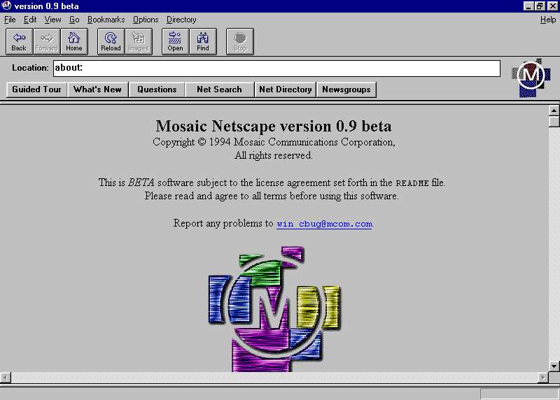
If you’re looking for context, the proposal was published a mere three days before Netscape’s browser — called Mosaic Netscape 0.9 — was introduced. This was a fairly turbulent time in the history of the web, one that we tend to refer to refer as the start of “The Browser Wars”.
If you can believe it, HTML itself was getting out of control and at risk of losing out to alternative ways of writing markup. CSS, in a way, was an HTML enhancement to make it more competitive:
Not long after [Lie] began at CERN, the language of the web shifted. Realizing that the web’s audience could not stare at black text on a white background all day, the makers of Mosaic introduced a tag that let website creators add inline images to their website. Once the gate was open, more features rushed out. Mosaic added even more tags for colors and fonts and layout. Lie, and the team at CERN, could only sit on the sidelines and watch, a fact Lie would later comment on, saying, “It was like: ‘Darn, we need something quick, otherwise they’re going to destroy the HTML language.’”
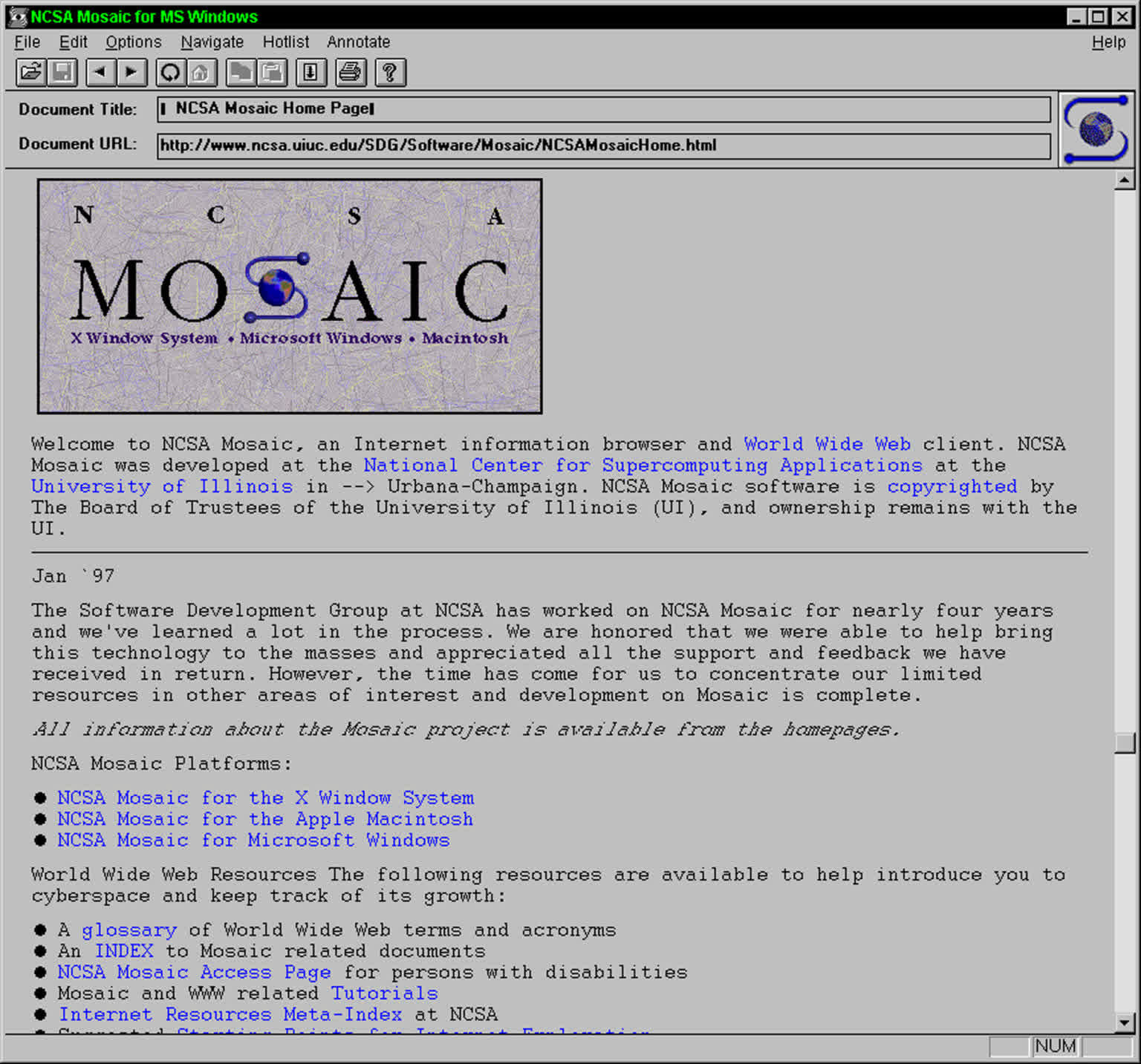
We can continue the detailed history, but let’s instead skip a few critical years and time travel to 1997. Eric Meyer and his team began to document early standards for using cascading styles, including his seminal post, “Creating Your First Style Sheet”. It’s here that we can see some of the earliest examples of style rules that contain property-value pairs:
BODY {font-family: serif;}In the beginning, it was a great revolution. There was no need to rewrite the attribute values on all pages to change, for example, the heading color; one small change in cascading styles was enough. This was a great time-saving breakthrough for developers everywhere, introducing structure to how styles are applied to web documents.
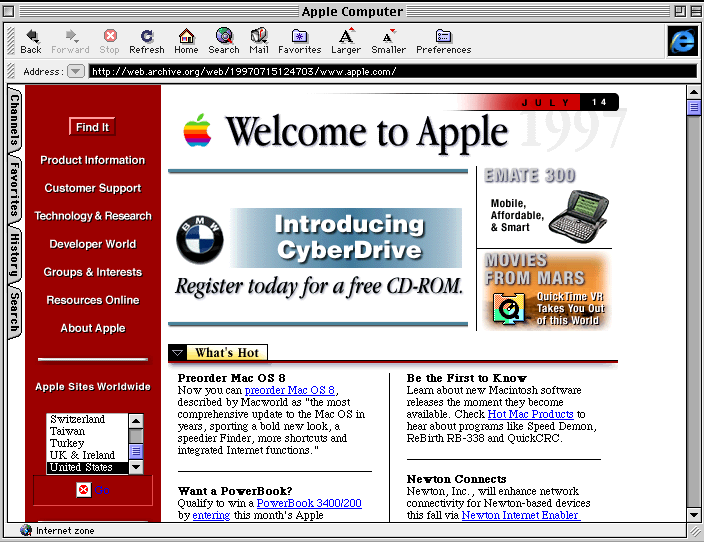
At the expense of glossing over other important advancements, let’s just say that CSS started to find its place in the evolving field of web design. However, there was still a long way to go in terms of writing structured CSS that operates at scale; that is, strategies for managing the cascade.
The evolution of CSS
Back when web content consisted mostly of headings, text and blue underlined links (hyperlinks), CSS was still in its early days and the design of the language was taking shape. It wasn’t yet clear how it would evolve or what problems it would need to solve. At that time, selector collisions weren’t a concern, because web pages were simple and there was no need for complex styles.
As the web and its complexity evolved, the first problems related to selector and naming collisions, maintanance and specificity began to appear.
Applications started to have higher usability demands, which led to more complex interface structures and, as a result, to a growing number of CSS selectors that collided with each other. Developers therefore began looking for ways to solve these problems.
1996–2008
One way to avoid naming collisions is to increase the “strength of a selector,” which is called specificity. It works great in the short term but usually gets out of control sooner or later.
CSS specificity is like a rank that determines which set of rules will be applied to an element instead of other sets of rules. If the browser finds two conflicting styles pointing to the same element, it will apply the rules with the higher “ranking.”
The following code example shows the scoring of randomly selected CSS selectors:
*                /* a=0 b=0 c=0 -> specificity =   0 */
LI               /* a=0 b=0 c=1 -> specificity =   1 */
UL LI            /* a=0 b=0 c=2 -> specificity =   2 */
UL OL+LI         /* a=0 b=0 c=3 -> specificity =   3 */
H1 + *[REL=up]   /* a=0 b=1 c=1 -> specificity =  11 */
UL OL LI.red     /* a=0 b=1 c=3 -> specificity =  13 */
LI.red.level     /* a=0 b=2 c=1 -> specificity =  21 */
#x34y            /* a=1 b=0 c=0 -> specificity = 100 */
#s12:not(FOO)    /* a=1 b=0 c=1 -> specificity = 101 */
For years, people have written about how the whole idea of the cascade was foolish, poorly designed, or conceived for simple web pages — an idea that doesn’t work for more robust web applications. That’s also why so few developers want to understand the basic principle of specificity.
That’s actually quite understandable — the calculation itself is fairly complex, and specificity weights are a lot to hold in your head while writing a stylesheet. I recommend this excellent demo by Manuel Matuzovic, where you can experiment with adding more specific selectors and get a feel for how it all works.
However, in order to avoid problems with specificity, it’s essential to understand at least the basic ideas — to be aware that such a mechanism exists and to know how to avoid these problems. Today there are many tools and techniques that allow us to work with specificity more effectively, so we don’t even have to think about how it works.
ID and classes
In the beginning, we didn’t have many options. We achieved changes in selector specificity by nesting selectors, changing the order of selectors, writing styles inline, or using !important. A common practice was to divide the document into several sections and give each one a unique ID, which gave us further possibilities for combinations.
<header id="header">
<main id="main">
<footer id="footer">
#header a {text-decoration: none;}
#main a {text-decoration: underline;}
#footer a {font-size: 16px;}Since an ID selector has higher specificity, we prevent conflicts between identically named classes and temporarily solve this problem. This originally seemed like a good idea, but the problem is that IDs are unique, which means that:
- Each element has only one ID.
- There is only one element with that particular ID on the page.
That is why this principle does not work in the long run and cannot be applied to larger applications. You cannot reuse the styles, and if you are working on a large project, it slows down the development process. It is good practice to avoid using IDs in CSS, because such code can then be more scalable and modular, which we cannot achieve with IDs.
Using !important
Another way to control specificity is with !important. !important at the end of a CSS value gets a specificity score of 10,000 points, which overrides all other declarations.
Unfortunately, this approach isn’t ideal either, because it only solves the problem in the short term. Adding this notation to our code doesn’t fix specificity conflicts, because over time we can end up with several rules fighting each other.
.foo {
  property: value; /* normal declaration */
  property: value ! important; /* important declaration */
  property: value !important; /* important declaration (preferred) */
}
On top of that, by using this approach we avoid taking advantage of CSS and make the code confusing and really hard to fix — and that’s probably the biggest problem of all.
Relying on increasing specificity when adjusting styles usually creates a snowball effect, forcing everyone on the team to raise specificity even further, which makes overriding styles harder and harder. That’s why it’s good practice to avoid !important when dealing with specificity conflicts and to consider a different approach instead.
!important has its place and it’s fine to use it as long as we know why we’re using it. We should never use !important to fix problems with existing CSS.
Do not use !important reactively. Do not use !important to solve a specificity issue. Do not use !important in anger.
OOCSS
The first methodology that tried to bring some order to writing CSS was Object Oriented CSS (OOCSS), introduced in 2008 by Nicole Sullivan. She borrowed an idea from software engineering: treat recurring parts of the interface as independent objects, give each a class, and reuse those classes across the whole site.
OOCSS rests on two principles: separate structure (layout) from skin (visual look), and separate container from content, so objects look the same wherever they’re placed.
.button {
  display: inline-block;
  padding: 16px 32px;
}

.button-primary {
  color: white;
  background: black;
}<button class="button button-primary">Save</button>OOCSS is rarely used on its own today, but its flat, reusable classes paved the way for BEM, SMACSS, and utility-first frameworks.
2009-2010
Around the time the first CSS methodologies started to appear, people also began to think about how to write CSS in a way that minimized specificity problems. Methodologies like BEM, SMACSS and ITCSS emerged as a response to these issues.
BEM
These methodologies were a reaction to increasingly complex web applications, where maintaining CSS the traditional way was no longer easy. BEM was used mainly for writing CSS in a component-based approach and for keeping the structure of components clear.
// ====================================================================
// Foo.scss
// ====================================================================

/* Component structure:
  .Foo
  .Foo__element
  .Foo--modifier
*/

// Block
.Foo {
  color: $foo-color;
  background: $foo-bg-color;
}

// Element: __element
.Foo__element {
  color: $foo-color;
  background: $foo-bg-color;
}

// Modifier: --modifier
.Foo--modifier {
  color: $foo-bg-color;
  background: $foo-color;
}
Thanks to this methodology, it was easy to quickly recognize the structure of components and the relationships between them. What was a bit awkward, though, was the way component states were written — it felt rather convoluted and quite hard to read:
.component__element--modifier
.component__element--modifier-active

.component__element--modifier
.component__element--modifier-opened
2011
While this notation worked, it ran into the shortcomings of the methodology’s design in many respects. It was hard to tell whether something was a component state or a modifier, and people were looking for a better way to approach it.
SMACSS
That’s why people started using the state rules from the SMACSS methodology, which addressed exactly this need. With classes like is-active, is-collapsed, is-open and so on, it was easy to distinguish between component states without having to write long, complicated modifiers.
.foo {
    background-color: purple;
    color: white;
}

.foo.is-active {
    background-color: white;
    color: black;
}
Besides state types, SMACSS offers other recommendations too, such as splitting CSS into categories (Base, Layout, Module, State, Theme), which is essentially another attempt to structure and organize CSS files.
2012–2013
Tyto první metodologie spustily vlnu dalších, které navazovali na související problémy s udržitelností a škálovatelností CSS. V roce 2012 Nicolas Gallagher publikoval metodologii SUIT CSS, která byla navržena pro komponentový přístup v JavaScriptových aplikacích jako React nebo Angular.
SUIT CSS
Tato metodologie vychází z BEM, ale upravuje jeho zápis tak, aby byl čitelnější. Název komponenty se píše v PascalCase (.MyComponent), potomci se oddělují jednou pomlčkou a camelCase (.MyComponent-title), modifikátory dvěma pomlčkami (.MyComponent--large).
Pro stavy komponenty přebírá z SMACSS třídy s prefixem is- (.is-active, .is-open), které se vždy vážou na konkrétní komponentu a tak jde hezky odlišit stav od modifikátoru.
Jednou více inovativní novinkou pak je u této metodologie to, jak se zapisují pomocné třídy nesoucí jedinou vlastnost. Ty mají prefix u- (např. .u-textTruncate, u-textUpppercase apod.).
/* Component structure:
  .Button
  .Button-icon
  .Button--primary
  .Button.is-disabled
*/

.Button {
  display: inline-block;
  padding: 16px 32px;
}

.Button-icon {
  margin-right: 8px;
}

.Button--primary {
  color: white;
  background: black;
}

.Button.is-disabled {
  opacity: 0.5;
}<button class="Button Button--primary is-disabled">
<span class="Button-icon">★</span>
<span class="u-textTruncate">Save</span>
</button>Utility-first approaches in CSS emerged as a response to the maintenance and scalability problems of traditional CSS methodologies. Developers were looking for a way to curb the growing complexity of stylesheets as projects grew.
Atomic CSS
Atomic CSS was introduced in 2013 by Thierry Koblentz in his article Challenging CSS Best Practices, and it went against everything the previous methodologies stood for. Instead of naming classes after what the content means (.Button, .text-error), atomic classes are named after what they do — each one carries a single CSS rule and its name describes that rule.
The trade-off is that you stop writing CSS altogether once the set of classes exists. Classes are defined upfront, covering all the combinations you need, so in the long run no new CSS is added — you only reuse what’s already there. Styling then happens entirely in the markup, by composing classes like lego blocks.
/* atomic, non-semantic, single-purpose classes */

.d-block     { display: block; }
.ta-center   { text-align: center; }
.fw-bold     { font-weight: bold; }
.c-black     { color: black; }
.op-50 { opacity: 0.5; }<p class="d-block ta-center fw-bold c-black op-50">Save</p>Specificity conflicts disappear, because every selector is a single class with a single rule, and the stylesheet stops growing with the application. The cost is a more verbose HTML, no support for pseudo-elements like ::before or descendant selectors, and a new “language” of class names to learn. This mindset later became the foundation for other methodologies and frameworks like:
- Basscss (~2013)
- Tachyons (~2014)
- AMCSS (~2014)
- turretcss (~2014)
- Solid (~2015)
- Expressive CSS (~2015)
- Ekzo (~2015)
2014
This was the year the conversation split in two: ITCSS tried to tame CSS by organizing it into layers, while JSS and CSS-in-JS took the opposite route and moved styles out of stylesheets and into JavaScript altogether.
ITCSS
As applications grew larger and more robust, the problem was no longer just how to name a class, but where in the stylesheet that class should live. In 2014 Harry Roberts introduced ITCSS (Inverted Triangle CSS) in his talk Managing CSS Projects with ITCSS. Unlike the methodologies before it, ITCSS says almost nothing about naming — it is purely a way of ordering your source files so that the cascade works with you instead of against you.
Most of the usual overriding tricks — nesting a selector deeper, chaining another class, reaching for !important — simply stop being necessary, because anything written later is already more specific than what came before.
// main.scss

// 1. Settings — variables, config, no CSS output
@use 'settings/colors';
@use 'settings/typography';

// 2. Tools — mixins and functions, no CSS output
@use 'tools/media-queries';

// 3. Generic — reset, normalize, box-sizing
@use 'generic/reset';

// 4. Elements — bare HTML elements, still no classes
@use 'elements/headings';
@use 'elements/links';

// 5. Objects — structural, non-cosmetic patterns
@use 'objects/wrapper';
@use 'objects/media';

// 6. Components — designed pieces of UI
@use 'components/button';
@use 'components/card';

// 7. Utilities — single-purpose overrides
@use 'utilities/spacing';
Notice how the reach of each layer shrinks while its specificity grows. The h2 in /elements/ styles every heading on the site; .o-media in /objects/ only affects elements that opt into the pattern; .c-card__title in /components/ affects one part of one component; and .u-mb-0 in /utilities/ affects exactly one property, deliberately last:
/* 4. Elements — every h2 on the site */
h2 { font-size: 24px; margin-bottom: 16px; }

/* 5. Objects — structure only, no cosmetics */
.o-media { display: flex; gap: 16px; }

/* 6. Components — one specific piece of UI */
.c-card__title { font-size: 20px; color: #333; }

/* 7. Utilities — wins on purpose */
.u-mb-0 { margin-bottom: 0 !important; }
Where BEM and SUIT CSS answered the question of what to call a class, ITCSS answers where that class belongs, which is why the two are so often used together, as in Roberts’ own inuitcss framework.
CSS-in-JS

In November 2014, Christopher Chedeau of Facebook’s React team gave the talk that named the approach: React: CSS in JS. He listed seven problems CSS hits at scale, from the global namespace and dead code to non-deterministic resolution. He argued they all came from CSS lacking the module system the rest of the codebase already had.
His proposed fix was deliberately blunt: skip the stylesheet and pass styles to React components as plain JavaScript objects through the style prop. Styles live next to the component, are imported like any other dependency, get deleted along with it, and share constants through ordinary variables. Since inline styles apply directly to the element, the cascade and specificity never come into play.
const styles = {
  button: {
    display: 'inline-block',
    padding: '16px 32px',
    color: 'white',
    background: 'black',
  },
};

const Button = () => <button style={styles.button}>Save</button>;
Inline styles, however, can’t do everything a stylesheet can: no :hover, no media queries, no ::before. JSS, released the same year by Oleg Isonen, compiled the same objects into a real stylesheet with unique class names instead. Pseudo-classes and media queries worked again, and naming collisions still couldn’t happen.
import jss from 'jss';
import preset from 'jss-preset-default';

jss.setup(preset());

const { classes } = jss.createStyleSheet({
  button: {
    display: 'inline-block',
    padding: '16px 32px',
    color: 'white',
    background: 'black',
    '&:hover': {
      background: '#333',
    },
  },
}).attach();

document.body.innerHTML = `<button class="${classes.button}">Save</button>`;<button class="button-0-2-1">Save</button>.button-0-2-1 {
display: inline-block;
padding: 16px 32px;
color: white;
background: black;
}
.button-0-2-1:hover {
background: #333;
}These two models, inline styles and generated stylesheets, defined everything that followed. Radium stuck with inline styles the very next year and reimplemented :hover in JavaScript, while most later libraries followed JSS, which itself stayed framework-agnostic and powered Material-UI’s styling layer for years.
2015
In 2014, scoping styles meant moving them into JavaScript. In 2015, a build step showed you could keep both the scoping and the stylesheet. A new approach was starting to take shape, one that would once again change how we think about stylesheets.
CSS Modules
Around 2015, while the community was experimenting with utility-first approaches and CSS-in-JS solutions, another alternative started to take shape, one meant to address the specificity problem (more precisely, the global scope of CSS). The CSS Modules approach was introduced by Mark Dalgleish and Glen Maddern; Mark in his talk at ReactiveConf, Glen in an article on his blog. They responded to the same problems as CSS-in-JS, but kept the traditional CSS syntax and workflow, which was more familiar to CSS developers.
CSS Modules are not an official specification or a browser implementation, but a build-step process (with the help of Webpack and similar tools) that changes class names and selectors so that they are scoped (that is, so they have a local scope and no conflicts occur).
Instead of writing plain HTML, we have to put all the coding into a JavaScript file, for example index.js.
import styles from './index.module.css';

element.innerHTML = `html<h1 class="${styles.title}">Hello, world!</h1>`;
During the build step, the compiler would scan the imported styles.css file, then go through the JavaScript we wrote and make the title class available via styles.title. Our build step would then process both of these into new, separate HTML and CSS files, with a new string of characters replacing both the HTML class and the CSS selector class.
Out generated HTML and CSS would look like this:
<h1 class="_styles_title_4o587j">Hello, world!</h1>._styles_title_4o587j {
font-size: 24px;
}The class attribute and the .title selector have disappeared entirely and been replaced by this completely new string; our original CSS is never exposed to the browser at all.
CSS Modules represented a middle ground between traditional CSS and the more radical CSS-in-JS approaches: the benefits of modular CSS without abandoning the familiar syntax, which made them a popular choice for projects where gradual migration mattered.
This new approach offered a way to sidestep the fairly complex mechanism of specificity without having to understand it. I do think, though, that every developer who works with styles should know the benefits of CSS’s global scope, because there are many use cases where it makes perfect sense.
RSCSS
While CSS Modules enforced scope with a build step, Rico Sta Cruz proposed keeping it a convention, just a cheaper one than BEM. RSCSS (Reasonable System for CSS Stylesheet Structure) came out of the observation that .component__element--modifier is exhausting to type and hard to read in markup.
The rules are few. A component name always has at least two words joined by a dash (.search-form), which alone prevents most collisions. Its elements are single words targeted through a child selector rather than a prefix (> .field), and variants are single words with a leading dash (.-small). The result is markup that stays short, because the scoping lives in the stylesheet instead of in every class name.
.search-form {
  display: flex;

  > .field {
    flex: 1;
  }

  > .action {
    color: white;
    background: black;
  }

  &.-compact {
    padding: 8px;
  }
}<form class="search-form -compact">
<input class="field" type="text">
<button class="action">Search</button>
</form>The cost is that scoping now depends on child selectors, so specificity is slightly higher than BEM’s flat classes and nesting has to be kept to one level deep. RSCSS never spread widely, but it is a good record of what teams disliked about BEM at the time, and the same impatience with verbose names shows up again in Tailwind two years later.
If that works, I can do Expressive CSS and Shed.css next. Note that Expressive CSS is already in your Atomic CSS list, so it may be worth deciding whether it belongs in both places.
Expressive CSS
By 2015 the utility-first idea was no longer controversial, but its class names were. Atomic CSS used .D(b) and .Fw(b), Tachyons used .tc and .b, and reading someone else’s markup meant learning a dictionary first. Expressive CSS, published by John Polacek in 2015, was a direct answer to that. The name is borrowed from the idea of expressiveness in programming languages: a language is expressive if it lets you state your intent in a way others can read. Polacek asked for the same from class names — someone opening your HTML for the first time should be able to guess the layout without opening a browser or the stylesheet.
In practice this means writing .float-right instead of .fr, keeping hyphens because they help the eye scan markup, and building on a real foundation of base element styles rather than a bare reset, so that unclassed HTML already looks reasonable and specificity stays low. Responsive variants follow the same readable logic through breakpoint prefixes, such as .s-hidden or .l-text-large. The rest of the philosophy is familiar: classes are for visual styling, tags are for semantics, and repeated declarations of padding, margin, font-size or alignment belong in a utility instead of in every component.
/* readable, single-purpose utilities */

.pad-1       { padding: 8px; }
.text-center { text-align: center; }
.text-bold   { font-weight: bold; }
.float-right { float: right; }
.border      { border: 1px solid #ccc; }

/* breakpoint prefixes for responsive variants */

.s-hidden      { display: none; }
.s-text-center { text-align: center; }<div class="border pad-1 text-center s-text-left">
<button class="text-bold float-right s-hidden">Save</button>
</div>Expressive CSS never became a framework people shipped — it’s closer to a set of authoring guidelines with a starter kit attached. Its value here is as evidence of what the community had settled on by 2015: the argument was no longer whether utility classes were acceptable, only how terse they should be. Tailwind would answer that question two years later by landing somewhere in the middle.
Expressive CSS
By 2015 the utility-first idea was no longer controversial, but its class names were. Atomic CSS used .D(b) and .Fw(b), Tachyons used .tc and .b, and reading someone else’s markup meant learning a dictionary first. Expressive CSS, published by John Polacek in 2015, was a direct answer to that. The name is borrowed from the idea of expressiveness in programming languages: a language is expressive if it lets you state your intent in a way others can read. Polacek asked for the same from class names — someone opening your HTML for the first time should be able to guess the layout without opening a browser or the stylesheet.
In practice this means writing .float-right instead of .fr, keeping hyphens because they help the eye scan markup, and building on a real foundation of base element styles rather than a bare reset, so that unclassed HTML already looks reasonable and specificity stays low. Responsive variants follow the same readable logic through breakpoint prefixes, such as .s-hidden or .l-text-large. The rest of the philosophy is familiar: classes are for visual styling, tags are for semantics, and repeated declarations of padding, margin, font-size or alignment belong in a utility instead of in every component.
/* readable, single-purpose utilities */

.pad-1       { padding: 8px; }
.text-center { text-align: center; }
.text-bold   { font-weight: bold; }
.float-right { float: right; }
.border      { border: 1px solid #ccc; }

/* breakpoint prefixes for responsive variants */

.s-hidden      { display: none; }
.s-text-center { text-align: center; }<div class="border pad-1 text-center s-text-left">
<button class="text-bold float-right s-hidden">Save</button>
</div>Expressive CSS never became a framework people shipped — it’s closer to a set of authoring guidelines with a starter kit attached. Its value here is as evidence of what the community had settled on by 2015: the argument was no longer whether utility classes were acceptable, only how terse they should be. Tailwind would answer that question two years later by landing somewhere in the middle.
Shed.css
- Windi CSS (~2020)
2016
Styled Components
styled-jsx
DoCSSa
2017
Emotion
Linaria
styled-system
Utility-first CSS
Tailwind CSS
2020
CUBE CSS
Stitches
Compiled
2021–2022
vanilla-extract
Cascade Layers
CSS Nesting (check)
Cascade Layers (check)
Container Queries (check)
2023
StyleX
Where We Are Today
Summing up today’s best practices based on historical evolution)
2009–2010
- BEM — ~2009 (Yandex; popularized in English ~2010–2012)
2011
- SMACSS — ~2011 (Jonathan Snook)
2012–2013
- SUIT CSS — ~2012 (Nicolas Gallagher)
- Atomic CSS — ~2013 (Thierry Koblentz, Challenging CSS Best Practices)
- Basscss — ~2013 (Brent Jackson)
2014
- Tachyons — ~2014 (Adam Morse)
- AMCSS — ~2014
- turretcss — ~2014 (https://turretcss.com/)
- ITCSS — ~2014 (Harry Roberts, Managing CSS Projects with ITCSS)
- JSS — ~2014 (Oleg Isonen)
- CSS-in-JS — ~2014 (Christopher Chedeau, React: CSS in JS, Nov 2014)
2015
- Radium — ~2015 (FormidableLabs; inline styles with pseudo-selector and media-query support)
- CSS Modules — ~2015 (Mark Dalgleish, Glen Maddern, Tobias Koppers)
- RSCSS — ~2015 (Rico Sta. Cruz)
- Expressive CSS — ~2015 (John Polacek)
- Shed.css — ~2015
2016
- Styled Components — ~2016 (Glen Maddern, Max Stoiber — ReactNL, Oct 2016)
- styled-jsx — ~2016 (Zeit/Vercel, alongside Next.js)
- DoCSSa — ~2016
2017
- Emotion — ~2017 (Kye Hohenberger)
- Linaria — ~2017 (Callstack)
- styled-system — ~2017 (Brent Jackson)
- Utility-first CSS — ~2017 (Adam Wathan, CSS Utility Classes and Separation of Concerns)
- Tailwind CSS — ~2017 (v0.1, Nov 2017)
2020
- CUBE CSS — ~2020 (Andy Bell)
- Stitches — ~2020 (Modulz; v1 in 2021)
- Compiled — ~2020 (Atlassian)
2021–2022
- vanilla-extract — ~2021 (Seek)
- Cascade Layers — ~2021 spec / 2022 browser support (Miriam Suzanne)
2023
- StyleX — ~2023 (Meta; open-sourced Dec 2023, internal use since ~2019)
The rise of Tailwind CSS and JavaScript frameworks
The period between 2017 and 2019 was marked by the rise of Tailwind CSS, which gradually became the dominant utility-first framework. Tailwind brought a higher level of configurability and flexibility, allowing developers to tailor the framework to their own needs. A major advantage cited in surveys and across the community was that they didn’t need to understand how native CSS features such as specificity, inheritance, or the cascade work.
As modern JavaScript frameworks grew in popularity, so did the need for better integration, which led to the development of specialized tools and plugins for React, Vue, and other frameworks between 2019 and 2022.
Right now we’re seeing a shift toward more mature tools that address the original drawbacks of utility-first approaches. Technologies such as PurgeCSS for automatically eliminating unused code, compilation that generates only the utility classes actually in use, and advanced customization options have taken these frameworks to a new level of efficiency.
CSS-in-JS
Zatímco frontend komunita experimentovala s utility-first přístupy, jiný paradigma tiše nabírali na síle: CSS-in-JS. Tento přístup reagoval na rostoucí sofistikovanost JavaScriptové ekosystému a potřeby vyřešit výzvy při psaní CSS u komponentového přístupu. Tento způsob práce se stal populární i možná pro to, že nastupující generace vývojářů viděla výhodu v tom, že jim tento způsob dokázal vyřešit mnoho problémů, které by jinak museli řešit kdyby používali nativní CSS.
Myslím si, že ti, kdo navrhli a nakódovali stovky webů a dokázali se do jazyka CSS ponořit dost hluboko, mají spíše kladný vztah k nativnímu stylování a vidí v něm především výhody. Naproti tomu ti, kteří si tento způsob jen osahávali a hned sáhnuli k alternativě, nemají k psaní nativního CSS kladný vztah.
První promo pro JavaScriptový (React) svět
CSS-in-JS vznikly kolem roku 2014 jako odpověď na problémy s CSS v komponentových architekturách (hlavně) React aplikací. Vývojáři a se snažili poukázat na problémy CSS a často zmiňovali několik oblastí: globální scope, závislosti, eliminace mrtvého kódu, minifikace, sdílení konstant, izolace, non-deterministic resolution, izolace apod.
Christopher Chedeau byl jedním z prvních, který rozhýbal ledy kolem CSS-in-JS. Na konferenci NationJS 2014 nejdříve zdůraznil problémy, které ho s nativním CSS trápí a následně poukázal, jak jde tyto problém řešit pomocí CSS-in-JS a byl teda jedním z prvních propagátorů tohoto přístupu.
TBD https://dev.to/srmagura/why-were-breaking-up-wiht-css-in-js-4g9b
Průkopník CSS-in-JS: Radium
Jako první knihovna, která vznikla je Radium. Tato knihovna se zaměřovala na inline zápis v React aplikacích a snažila se řešit problémy, které zmiňoval Christopher Chedeau ve své prezentaci. Jednalo se ale spíše o proof-of-concept ukazující možný směr, než že by se hodila pro dlouhodobě udržitelné komplexní aplikace.
<Button kind="primary">Radium Button</Button>var Radium = require('radium');
var React = require('react');
var color = require('color');
class Button extends React.Component {
static propTypes = {
kind: PropTypes.oneOf(['primary', 'warning']).isRequired
};
render() {
// Radium extends the style attribute to accept an array. It will merge
// the styles in order. We use this feature here to apply the primary
// or warning styles depending on the value of the `kind` prop. Since its
// all just JavaScript, you can use whatever logic you want to decide which
// styles are applied (props, state, context, etc).
return (
<button
style={[
styles.base,
styles[this.props.kind]
]}>
{this.props.children}
</button>
);
}
}
Button = Radium(Button);
// You can create your style objects dynamically or share them for
// every instance of the component.
var styles = {
base: {
color: '#fff',
// Adding interactive state couldn't be easier! Add a special key to your
// style object (:hover, :focus, :active, or @media) with the additional rules.
':hover': {
background: color('#0074d9').lighten(0.2).hexString()
}
},
primary: {
background: '#0074D9'
},
warning: {
background: '#FF4136'
}
};Další následníci
Rok poté, co se začalo mluvit o revolučním přístupu v psaní CSS se objevil Aphrodite - přístup, který navázal na předchozí pokusy a implementoval nové funkce jako nastavení font-face, keyframes pro animace, nebo použití mimo React.
Tyto přístupy začali být populární mezi JavaScriptovými vývojáři čím dál více, a proto se nepřestávalo zkoumat a vytvářet nová řešení. Od roku 2016 postupně vznikaly Styled-components, Emotion, JSS, Linaria, Compiled, Vanilla Extract, Stitches nebo Panda CSS.
Všechny tyto CSS-in-JS knihovny sdílely několik klíčových principů a hlavně to, že automaticky generovaly unikátní názvy tříd po kompilaci čímž dokázali eliminovat kolize pojmenování selektorů a vyřešili tak věc, kterou trápilo mnoho vývojářů - globální scope CSS. Vesměs skoro všechny nástroje dokázali navíc generovat CSS s nízkou specificitou a spolu s unikátními třídami redukovali rizika konfliktů.